Note
Go to the end to download the full example code.
Plot types#
This example shows how to start an Ansys Dynamic Reporting service via a Docker image and create different plot items. The example focuses on showing how to use the API to generate different plot types.
Note
This example assumes that you do not have a local Ansys installation but are starting an Ansys Dynamic Reporting Service via a Docker image on a new database.
Start an Ansys Dynamic Reporting service#
Start an Ansys Dynamic Reporting service via a Docker image on a new database. The path for the database directory must be to an empty directory.
import numpy as np

import ansys.dynamicreporting.core as adr

db_dir = r"C:\tmp\new_database"
adr_service = adr.Service(ansys_installation="docker", db_directory=db_dir)
session_guid = adr_service.start(create_db=True)
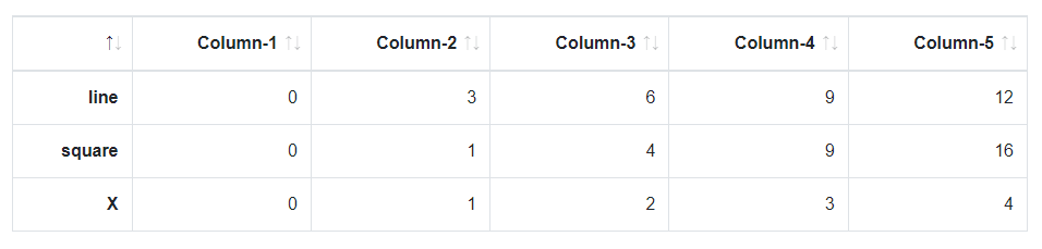
Create a simple table#
Let us start by creating a simple table and visualizing it. Create a table with 5 columns and 3 rows.
simple_table = adr_service.create_item(obj_name="Simple Table", source="Documentation")
simple_table.item_table = np.array(
    [[0, 1, 2, 3, 4], [0, 3, 6, 9, 12], [0, 1, 4, 9, 16]], dtype="|S20"
)
simple_table.labels_row = ["X", "line", "square"]
You can use the labels_row attribute to set the row labels. Use the visualize method on the object to see its representation. By default, it will be displayed as a table
simple_table.visualize()
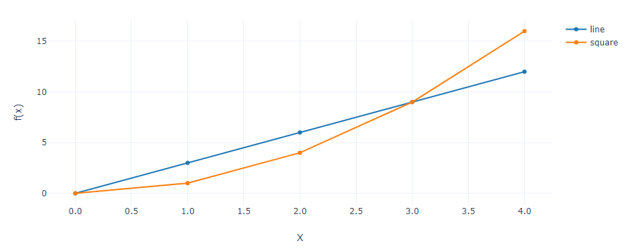
Visualize as a line plot#
Let us know create a new item that is the same as the previous simple table, but this time we will set the plot attribute to line to visualize the values as two line plots, and we will use the xaxis attribute to set which row should be used as the X axis. We can also control the formatting and the title of the axis separately with the axis_format and title attributes, as done below. The result can be seen in the following image.
line_plot = adr_service.create_item(obj_name="Line Plot", source="Documentation")
line_plot.item_table = np.array([[0, 1, 2, 3, 4], [0, 3, 6, 9, 12], [0, 1, 4, 9, 16]], dtype="|S20")
line_plot.labels_row = ["X", "line", "square"]
line_plot.plot = "line"
line_plot.xaxis = "X"
line_plot.yaxis_format = "floatdot0"
line_plot.xaxis_format = "floatdot1"
line_plot.xtitle = "x"
line_plot.ytitle = "f(x)"
line_plot.visualize()
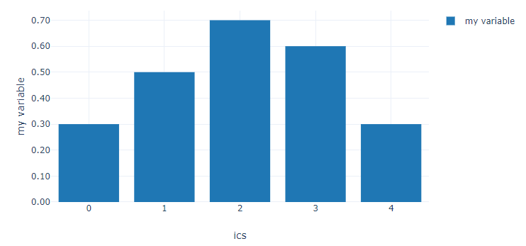
Visualize as a bar plot#
Next, we will see how to create a bar plot, and decorate it with the same attributes used in the previous code snippet. See the following image for the resulting visualization.
bar_plot = adr_service.create_item(obj_name="Bar Plot", source="Documentation")
bar_plot.item_table = np.array([[0, 1, 2, 3, 4], [0.3, 0.5, 0.7, 0.6, 0.3]], dtype="|S20")
bar_plot.plot = "bar"
bar_plot.labels_row = ["ics", "my variable"]
bar_plot.xaxis_format = "floatdot0"
bar_plot.yaxis_format = "floatdot2"
bar_plot.xaxis = "ics"
bar_plot.yaxis = "my variable"
bar_plot.visualize()
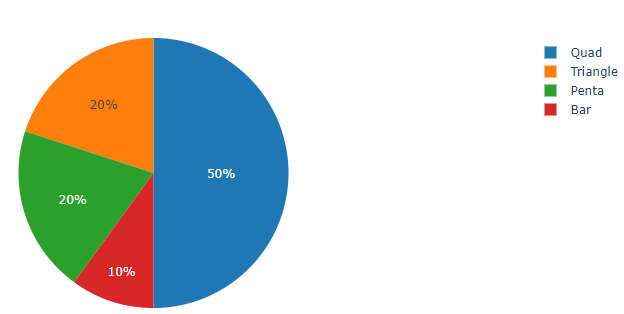
Visualize a pie chart#
Next supported plot type is the pie chart. Please see the following code snippet to generate the pie chart as in the following image.
pie_plot = adr_service.create_item(obj_name="Pie Plot", source="Documentation")
pie_plot.item_table = np.array([[10, 20, 50, 20]], dtype="|S20")
pie_plot.plot = "pie"
pie_plot.labels_column = ["Bar", "Triangle", "Quad", "Penta"]
pie_plot.visualize()
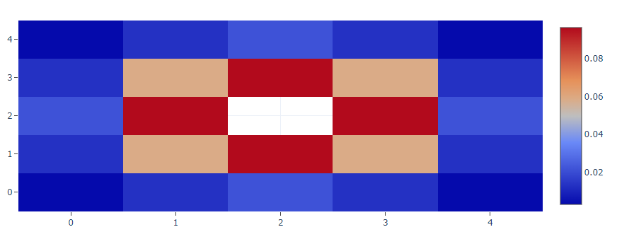
Visualize a heatmap#
Heatmaps are plots where at each (X,Y) position is associated the value of a variable, colored according to a legend. Here the snippet on how to create a heatmap representation - please note how nan values are also supported, resulting in empty cells.
heatmap = adr_service.create_item(obj_name="Heatmap", source="Documentation")
heatmap.item_table = np.array(
    [
        [0.00291, 0.01306, 0.02153, 0.01306, 0.00291],
        [0.01306, 0.05854, 0.09653, 0.05854, 0.01306],
        [0.02153, 0.09653, np.nan, 0.09653, 0.02153],
        [0.01306, 0.05854, 0.09653, 0.05854, 0.01306],
        [0.00291, 0.01306, 0.02153, 0.01306, 0.00291],
    ],
    dtype="|S20",
)
heatmap.plot = "heatmap"
heatmap.format = "floatdot0"
heatmap.visualize()
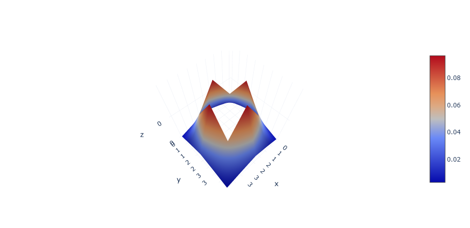
Visualize a 3D surface plot#
A 3D surface plot allows you to visualize the data points in a terrain-like surface in a 3D space powered by the WebGL engine. It is a variation of a heatmap as they share the same data structure. The difference is that the surface plot visualizes the heatmap values as the Z axis data, allowing you to zoom in and out, and rotate to view the surface from different angles. Like heatmap, nan values are also supported, resulting in empty holes on the surface.
surface = adr_service.create_item()
# We can use the same data as we use to visualize heatmap
surface.item_table = np.array(
    [
        [0.00291, 0.01306, 0.02153, 0.01306, 0.00291],
        [0.01306, 0.05854, 0.09653, 0.05854, 0.01306],
        [0.02153, 0.09653, np.nan, 0.09653, 0.02153],
        [0.01306, 0.05854, 0.09653, 0.05854, 0.01306],
        [0.00291, 0.01306, 0.02153, 0.01306, 0.00291],
    ],
    dtype="|S20",
)
surface.plot = "3d surface"
surface.format = "floatdot0"
surface.visualize()
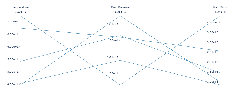
Visualize a parallel coordinate plot#
Parallel coordinate plots are especially useful when analyzing data coming from multiple runs. Place in each raw the values of variables for a given simulation. Each column is a different variable. The parallel coordinate plot allows you to visualize all this data in a way that stresses correlations between variables and runs.
parallel = adr_service.create_item()
parallel.item_table = np.array(
    [
        [54.2, 12.3, 1.45e5],
        [72.3, 9.3, 4.34e5],
        [45.4, 10.8, 8.45e4],
        [67.4, 12.2, 2.56e5],
        [44.8, 13.5, 9.87e4],
    ],
    dtype="|S20",
)
parallel.labels_column = ["Temperature", "Max. Pressure", "Max. Work"]
parallel.plot = "parallel"
parallel.visualize()
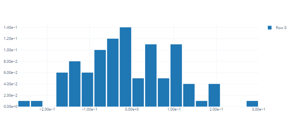
Visualize a histogram#
Now, let us create a gaussian distribution via numpy and display it as an histogram. Let us set the histogram to be normalized, and play with the bin size and gaps.
histo_data = adr_service.create_item()
histo_data.item_table = np.random.normal(0, 0.1, 100)
histo_data.plot = "histogram"
histo_data.histogram_normalized = 1
histo_data.histogram_bin_size = 0.03
histo_data.visualize()
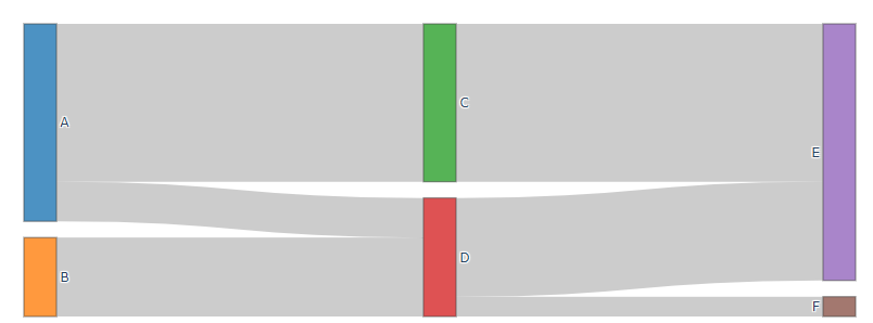
Visualize a Sankey diagram#
A Sankey diagram allows you to visualize the relationship between different elements. For this reprenstation, place the information inside a squared table.
sankey_plot = adr_service.create_item()
sankey_plot.item_table = np.array(
    [
        [0, 0, 8, 2, 0, 0],
        [0, 0, 0, 4, 0, 0],
        [0, 0, 0, 0, 8, 0],
        [0, 0, 0, 0, 5, 1],
        [0, 0, 0, 0, 0, 0],
        [0, 0, 0, 0, 0, 0],
    ],
    dtype="|S20",
)
sankey_plot.labels_row = ["A", "B", "C", "D", "E", "F"]
sankey_plot.labels_column = ["A", "B", "C", "D", "E", "F"]
sankey_plot.plot = "sankey"
sankey_plot.visualize()
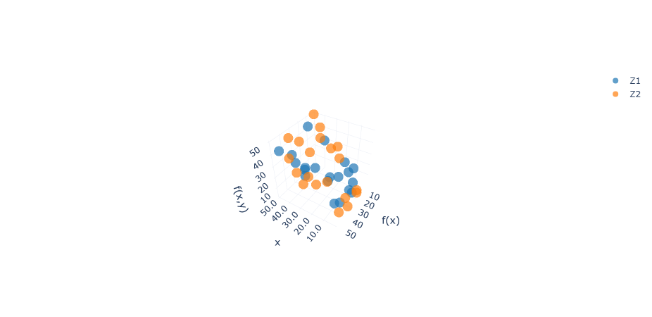
Visualize a 3D scatter plot#
A 3D scatter plot allows you to visualize the data points in 3D space powered by the WebGL engine. You can zoom in and out, and rotate to view the data from different angles.
scatter_plot_3d = adr_service.create_item()
scatter_plot_3d.item_table = np.random.uniform(1.0, 50.0, size=(6, 20))
scatter_plot_3d.labels_row = ["X1", "Y1", "Z1", "X2", "Y2", "Z2"]
scatter_plot_3d.plot = "line"
# specified the 3D scatter's line style (default is markers+lines)
scatter_plot_3d.line_style = "none"
# specified the 3D scatter's symbol (default is solid circle)
# supportive: diamond, cross, x, circle, square (open & solid)
scatter_plot_3d.xaxis = ["X1", "X2"]
scatter_plot_3d.yaxis = ["Y1", "Y2"]
scatter_plot_3d.zaxis = ["Z1", "Z2"]
scatter_plot_3d.zaxis_format = "floatdot0"
scatter_plot_3d.yaxis_format = "floatdot0"
scatter_plot_3d.xaxis_format = "floatdot1"
scatter_plot_3d.xtitle = "x"
scatter_plot_3d.ytitle = "f(x)"
scatter_plot_3d.ztitle = "f(x,y)"
# opacity
scatter_plot_3d.line_marker_opacity = 0.7
# vis
scatter_plot_3d.visualize()
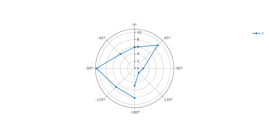
Visualize a polar plot#
A polar plot is a plot type that visualizes the data point in a polar coordinate system. One common variation of a polar plot is a radar chart. The data position is determined by:
Radius (r): The distance from the center of the polar plot, defined by the yaxis property.
Theta (θ): The direction of the point, measured in numeric degrees or categorical data, defined by the xaxis property.
Note
Scatter polar is the only available polar plot type for now.
The theta (θ) value is defined by the data type of the xaxis values:
If xaxis values have minus numeric value: The labels will be a list of symmetrical values from “(-180°) - (180°)”.
If xaxis values are all positive values: The labeles will be from “(0°) - (360°)”.
If xaxis values are categorical values: All xaxis values will be used to label.
polar = adr_service.create_item()
# We can use the same data as we use to visualize heatmap
polar.item_table = np.array(
    [
        ["-180", "-135", "-90", "-45", "0", "45", "90", "135", "180"],
        [8.2, 7.3, 10.6, 5.6, 5.9, 9.1, 2.4, 1.6, 4.8],
    ],
    dtype="|S20",
)
polar.plot = "polar"
polar.format = "floatdot0"
polar.xaxis = 0
polar.format_row = "str"
polar.labels_row = ["theta", "r"]
polar.visualize()
Close the service#
Close the Ansys Dynamic Reporting service. The database with the items that were created remains on disk.
# sphinx_gallery_thumbnail_path = '_static/01_connect_3.png'
adr_service.stop()